News
Check back here regularly to find out what's going on at our company.
01/08/2018
What does the logo mean, anyway?
Now that Continuous Improvement Systems, LLC is getting more exposure, I’ve been asked a number of times, “So, what’s up with the logo?” or “What’s the meaning of the logo?” Some have even ventured further to, “Why is a Christmas PacMan your logo?” and if you look at the Facebook page, you’ll see what they mean. So, in this post, I’ll tell the story of the logo and what it means.
Back in the mid-2000’s when I was deep into the Lean methodology, studying Kanban with a number of noted sensei, the question of where to get started in a lean implementation was always a topic. There were schools of thought that you start at the customer delivery and work your way back. Another thought was to start at the beginning with your design or your suppliers and go forward through your value stream. Most took the approach you start at an area within the company, like your MRO warehouse, or an individual work cell area, to prove out the methods, gain buy in from the team, and then repeat in the rest of the areas as you gain traction. THEN, go after the Supply Chain.
So, the question became which area? The schools of thought differed again, with some specifying the “easiest” so you’re ensured a success to show the rest of the team, while others wanted the “hardest” because, if it works in the hard area, it sure can work in the easier ones.
I’ve been involved in a number of lean implementations, and started in all four ways I just described. The ones that worked well, gained traction, and sustained were the ones where we started in an area that was containable, meaning we could insulate it from the rest of the stream. We’d “lean it out”, and then proceed to other areas, usually the ones before and after within the company value stream, and kept on this path until it permeated the entire location.
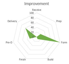
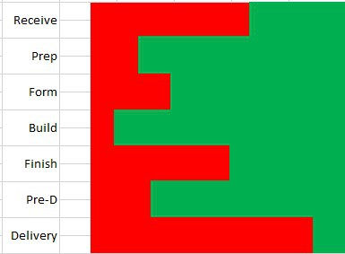
A teammate of mine who was on the same learning path at the time and I were discussing how to graph the KPI improvements we were seeing. After going through Excel’s different graph wizards (column, bar, surface, pie…) the Area chart seemed to make the most sense, (although if we could have figured out the Radar chart, that would have visually represented the floor of a factory!)
We got into the different KPI measurements, and as it was truly an iterative effort, the gains wouldn’t improve across the whole value chain until the value chain was complete. If you think of an assembly line, you’re not going to get more product out the door until the whole line was complete. So your throughput graph would look like:
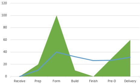
The Production managers would throw us out of the building!!!
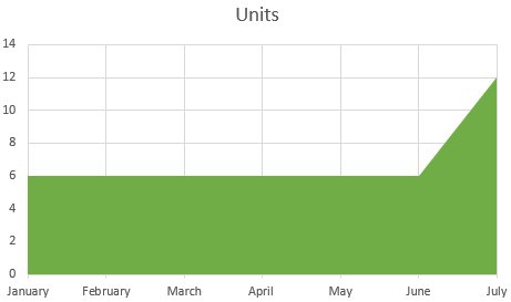
And a straight area chart wouldn’t show the improvement until the very end:
So, as we’re standing at a whiteboard and drawing, “ya know, it’s really something like:”
or
“Where we start at NO improvement, and pick an area or three and make incremental improvements, and then keep iterating.”
“Yeah, but those are really ugly. “
“If we really wanted to do it right, we’d pick an area, lean it out, then pick the areas before and after it in the value stream and improve them, then the areas around THOSE areas, and so on.:”
“So we’re showing that even though overall throughput isn’t improved yet, we ARE making improvements and we’re 20%, 60%, 72.5% complete.”
“Yeah…. Continuous Improvement!!”
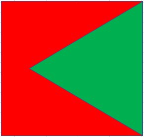
And there’s the inspiration for the logo!
Back in 2006-7 though, we'd never heard of Facebook, let alone that they would change their post picture from square to round!!
I’ll have to work on a revision that fits the circle….